Australia's worst superannuation funds feel APRA's heat

Identifying bad superannuation funds will be easier from December with a new colour coded heat map from the superannuation fund regulator, APRA.
There are currently around 100 MySuper funds but it can be complex to tell the good value, strongly performing funds from the poor funds. You need to work out the fees as well as compare the returns.
This is where APRA's heat map colours will help.

It will identify if your superannuation fund is a chronic underperformer and charging high fees or is in line with other funds. The worst superfunds are coloured crimson through to yellow to pale yellow to white.
The white colour indicates a MySuper product is performing around or above benchmarks for investment performance, fees and costs.
The heat map is designed to emphasise underperformance and high fees, explained Helen Rowell, the APRA deputy chair, at the ASFA national conference last week. APRA estimated there is a 6% difference in performance between the top funds (returning 10%pa) and bottom superannuation fund (3.5%pa) over five years.
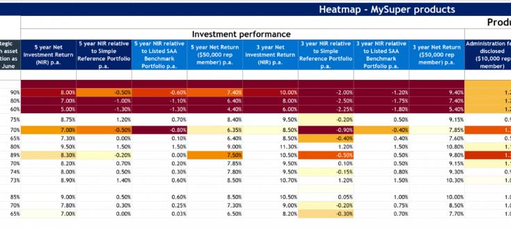
The fees ranged from 0.3%pa up to around 2% pa. These differences can add up substantially over the long term and impact on a member's retirement wealth.
"APRA intends to turn up the heat on trustees that aren't serving their members' best interests - either by forcing them to lift the outcomes they deliver or forcing them out," says Rowell.
APRA has been given stronger powers and beefed up its quality data. As well APRA has more of a consumer focus by adopting a new willingness to publicly call out underperformers, following on from the Royal Commission last year.
Rowell says APRA is committed to collecting and publishing "more granular, reliable and accessible superannuation data."
Rowell however pointed out that there is no overall assessment for funds and it is possible for a product to be white for some investment performance metrics, yellow for others and red for fees and costs.
Each metric is divided into sub-categories. For example, the heat map covers four different measures of investment performance.
Rice Warner says that many superannuation funds will be uncomfortable with the increased scrutiny of APRA's heat map approach.
"They may feel that the results are not representative or will argue that the measurement techniques are inherently flawed."
"In our conversations with funds over recent months, many have expressed concern that any generic measure of performance will not adequately reflect some idiosyncrasy of their fund and may misrepresent its performance."
But Rice Warner says that APRA's heat maps are here to stay and will be expanded over time to incorporate choice investment strategies and retirement products. Also APRA will review other aspects such as those relating to life insurance.
Get stories like this in our newsletters.